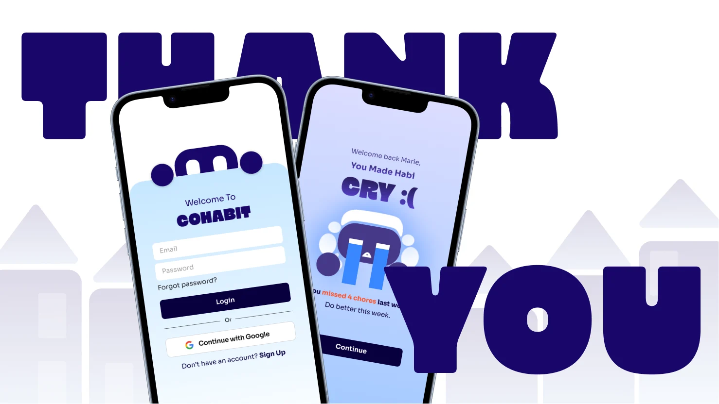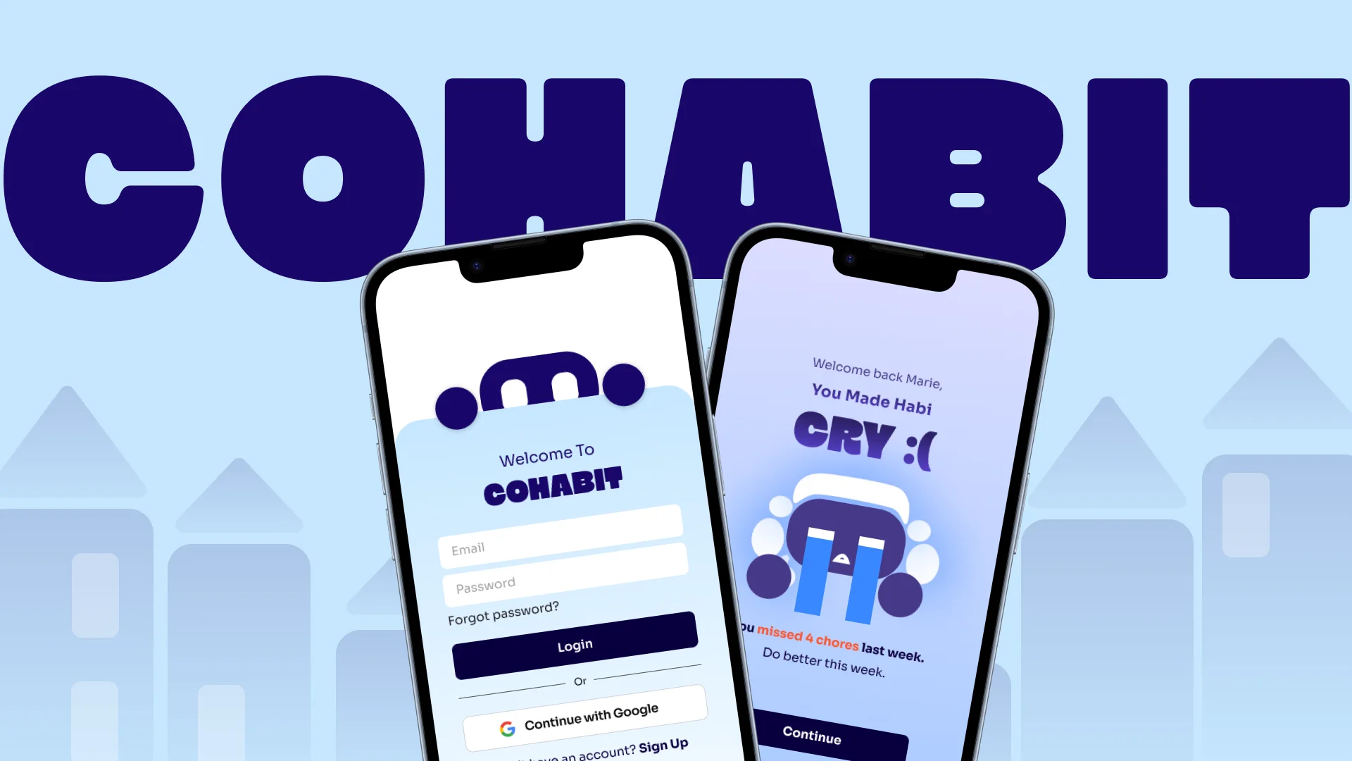
Cohabit app: the login screen and the missed-chores screen where the Habi mascot is crying

COHABIT

A Shared Living Tool Building Accountability For College Roommates

Role

  • UX Lead
  • Ideation & Branding Lead
  • Design Lead

Team

  • Chishala Kalenga
  • Anushka Binakiya
  • Marie Cabibihan
  • Andrew Hammond

Tools

  • Figma
  • Photoshop
  • Illustrator

Duration

  • 10 Weeks

Overview

60-70% of college students report conflict with a roommate, and nobody wants to be the “bad guy” nagging friends to help around the room, which only breeds quiet resentment. Cohabit takes that job over. It brings accountability to your room through photo proof, AI smart notifications and a friendly roommate called Habi.

But We Want to Hear From the Real People It’s Affecting
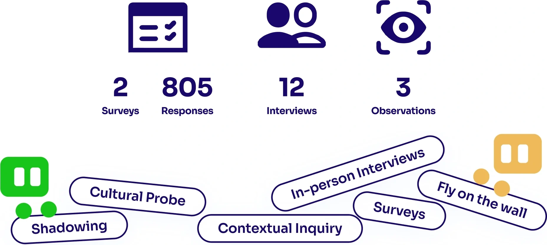
Research summary: 2 surveys with 805 responses, 12 interviews and 3 observations, using methods like shadowing, cultural probes, contextual inquiry, in-person interviews, surveys and fly on the wall.
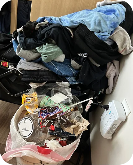
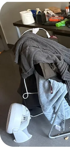
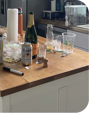
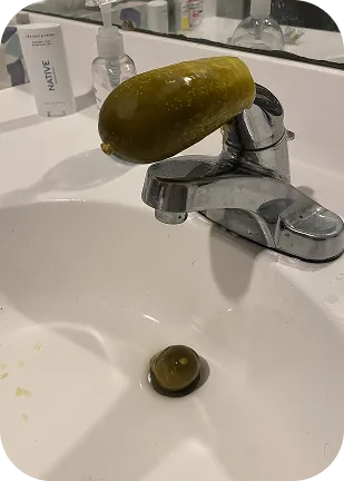
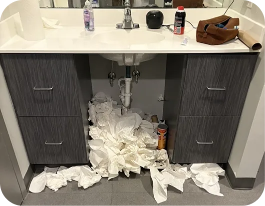
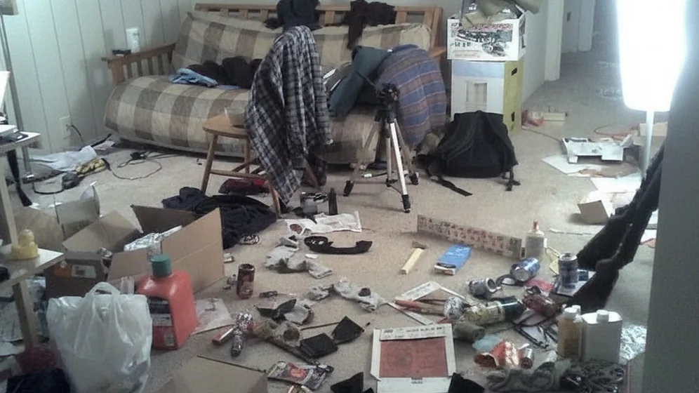
Overflowing trash can beneath a pile of clothesChair buried under towels next to a fanKitchen counter covered in empty bottles and cupsA pickle left on a bathroom faucetWadded tissue spilling out from under a bathroom sinkLiving room floor covered in clutter
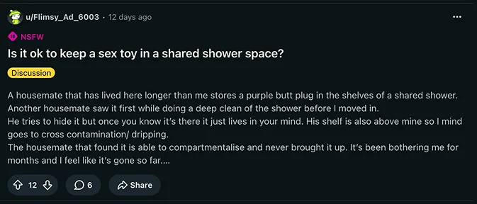
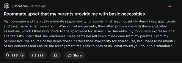
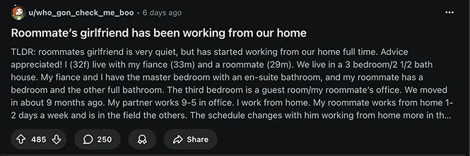
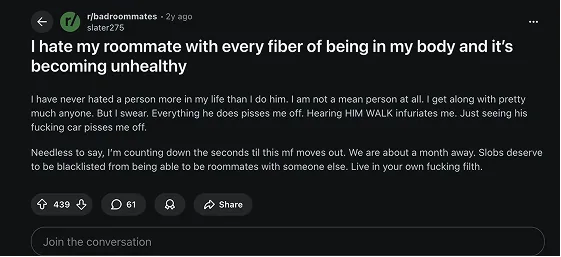
Reddit post: Is it ok to keep a sex toy in a shared shower space?Reddit post: Roommate upset that my parents provide me with basic necessitiesReddit post: Roommate's girlfriend has been working from our homeReddit post: I hate my roommate with every fiber of being in my body

Digging Deep

Our cultural probe showed us the mess. Interviews, surveys and observations showed us why nobody talks about it.

We found two numbers that displayed the problem clearly:

  • of roommate splits come down to cleanliness, according to RAs.

  • of students manage chores informally.

It Boiled Down to the Same Steps

  1. Standards are not established
  2. One person ends up doing more
  3. Quiet resentment builds
  4. “How do I raise this without making it worse?”
  5. Someone is forced to be the “Bad Guy”

This Gave Us Our Main Design Ideas

  • Set rules
    beforehand
  • Make proof
    shared
  • Assign who
    gets what

Original Concepts

Our initial low fidelity design concepts based around our pain points discovered through research.
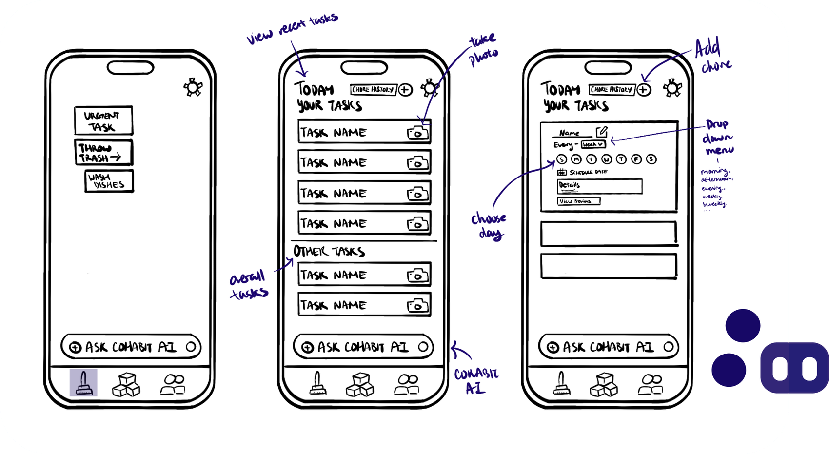
Three hand-drawn phone wireframes: a home screen with urgent task, throw trash and wash dishes; a Today list of tasks with a camera button on each row and an Ask Cohabit AI bar; and an add-chore form with a day picker and a repeat drop-down. Dark purple Habi characters sit at the bottom right.

Chores

Today’s tasks up front, with a camera on every row for photo proof. Adding a chore takes a name, a repeat and the days it happens.

Swipe to see the whole board.
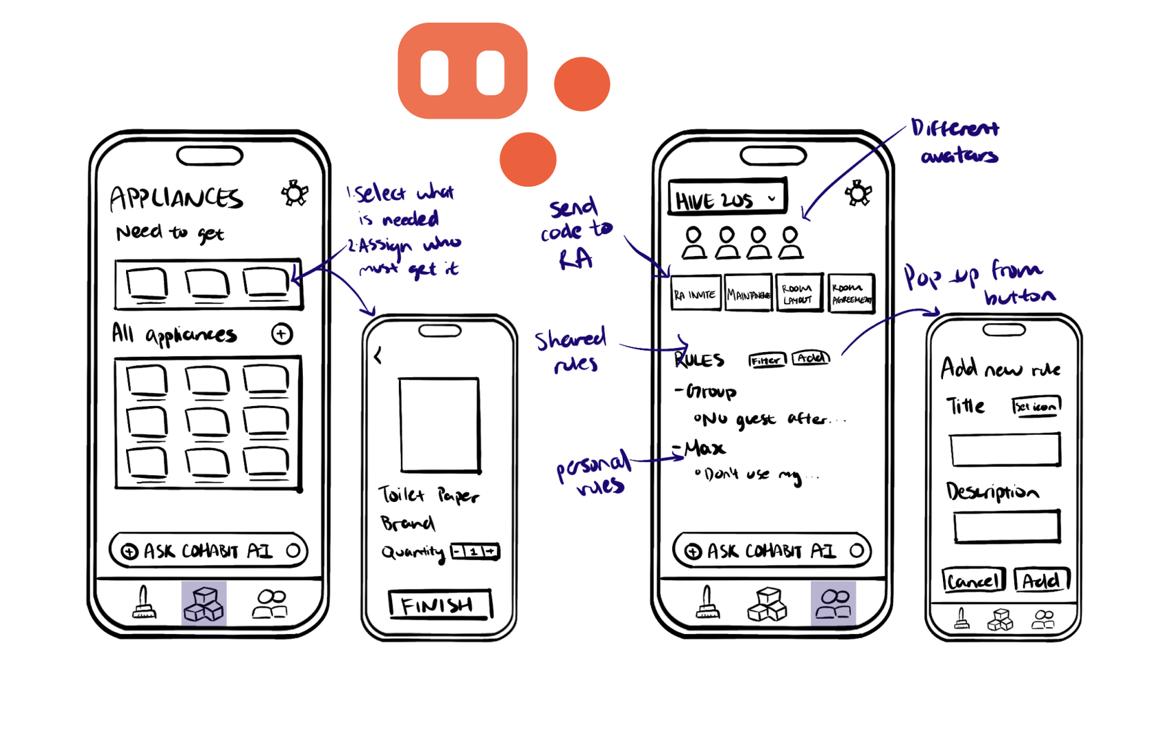
Four hand-drawn phone wireframes: an Appliances screen with a needed row and an all-appliances grid, an item screen with quantity and a Finish button, a Group screen for a room with avatars, RA invite, maintenance, room layout and room agreement buttons plus shared and personal rules, and an add-new-rule pop-up. Orange Habi characters sit at the top.

Inventory and Group

Pick what the room still needs, then assign who gets it. The group tab holds shared and personal rules, plus a code to send to your RA.

Swipe to see the whole board.
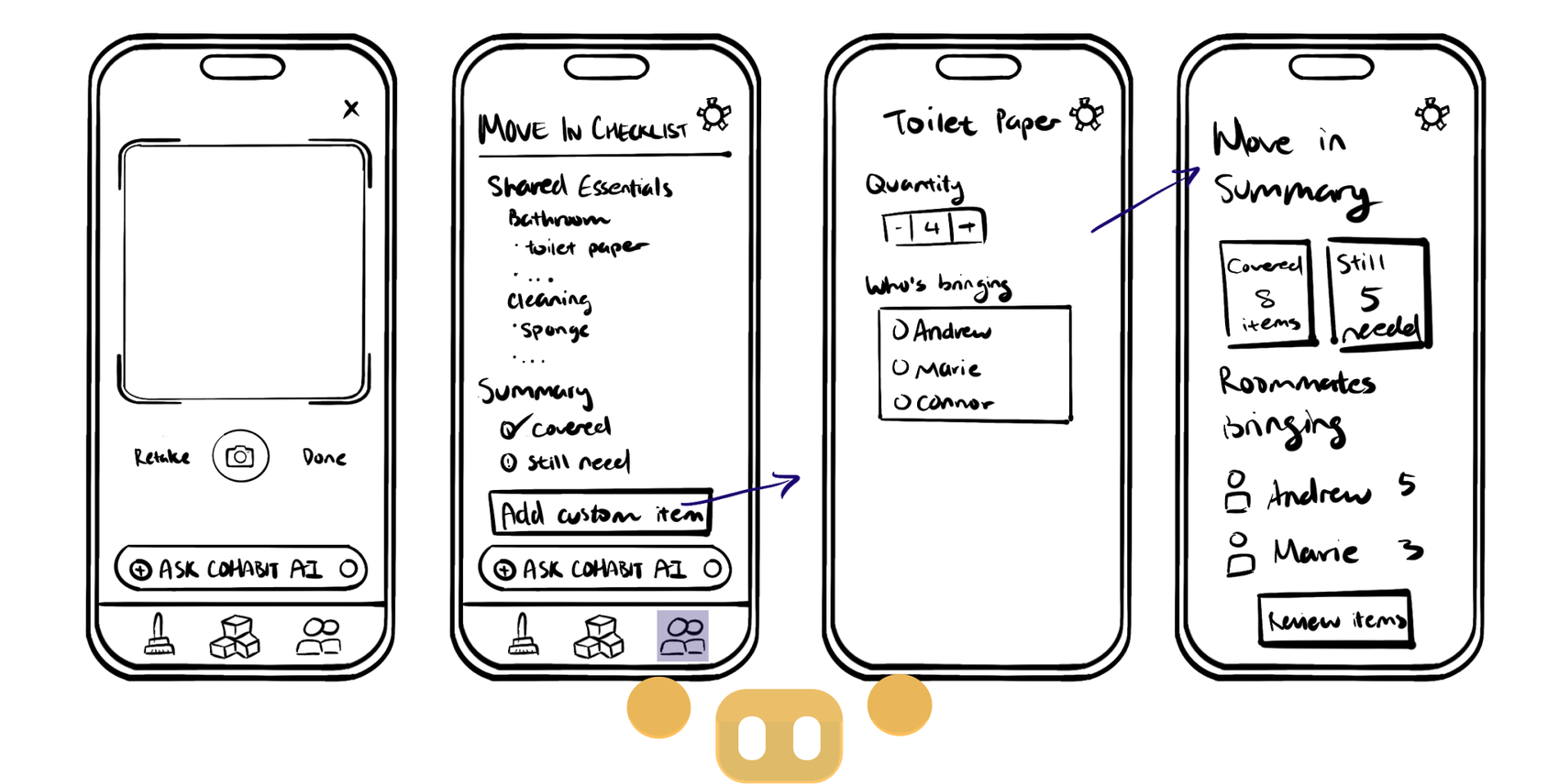
Four hand-drawn phone wireframes: a camera screen with retake and done, a move-in checklist of shared essentials with a covered and still-needed summary, a toilet paper screen with quantity and who is bringing it, and a move-in summary with item counts per roommate. Yellow Habi characters sit at the bottom.

Move-In

A shared essentials checklist with a covered and still-needed summary, so everyone can see who is bringing what.

Swipe to see the whole board.

Design Criteria

Before moving up in fidelity, we agreed on four rules every screen had to pass. They became our checklist for each decision after this.
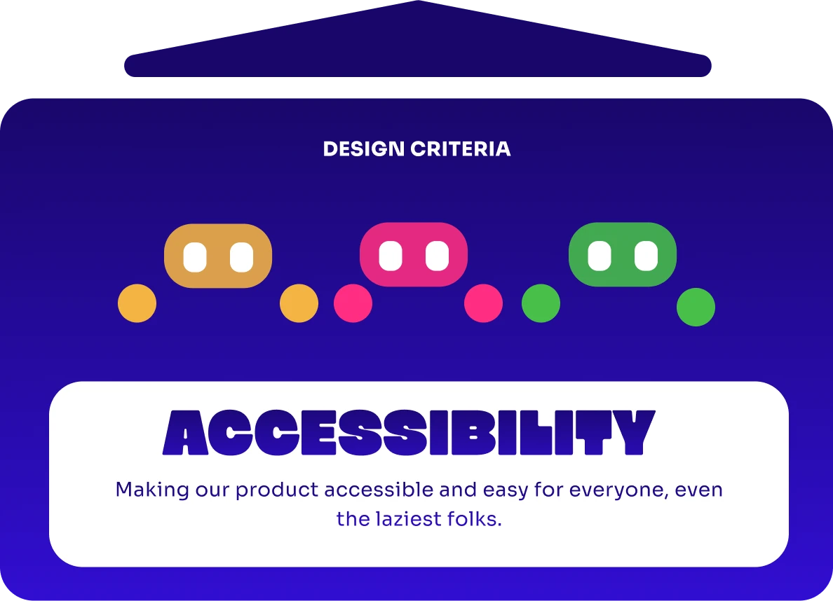
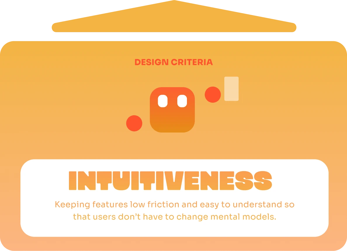
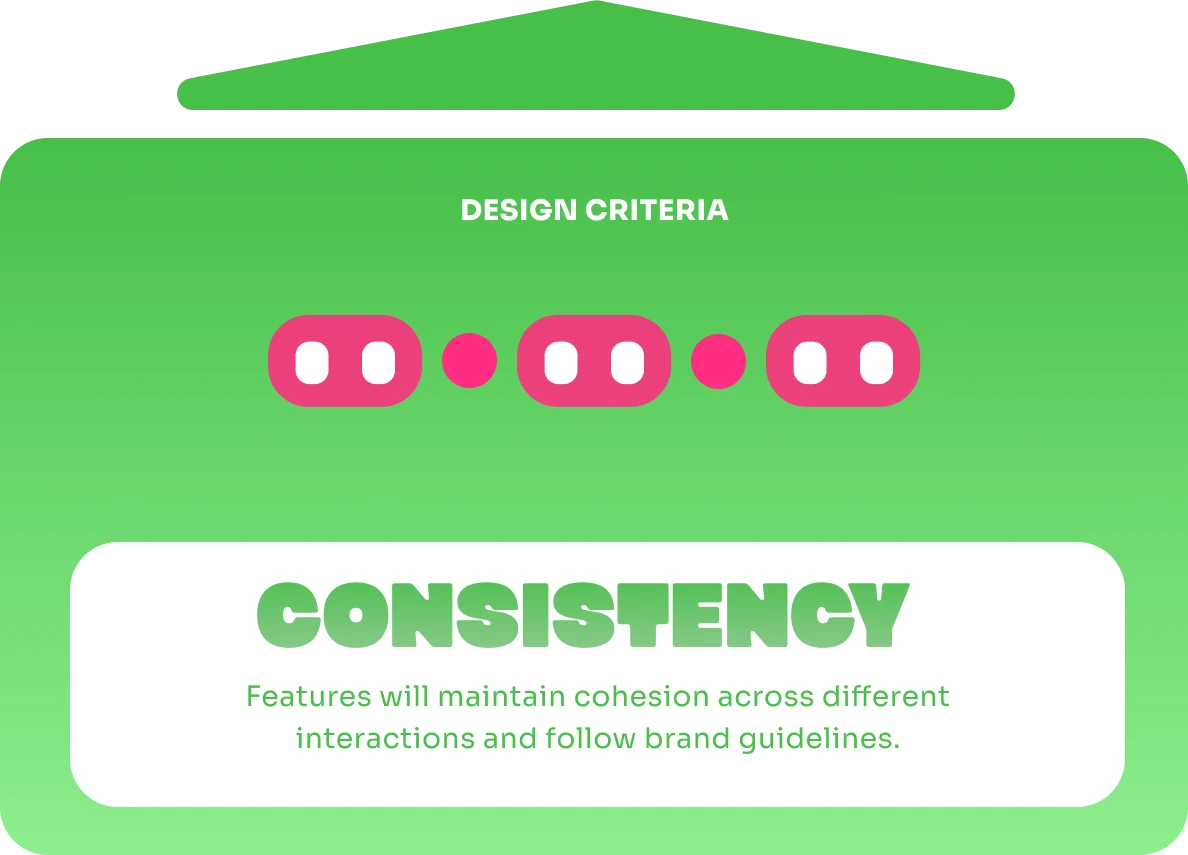
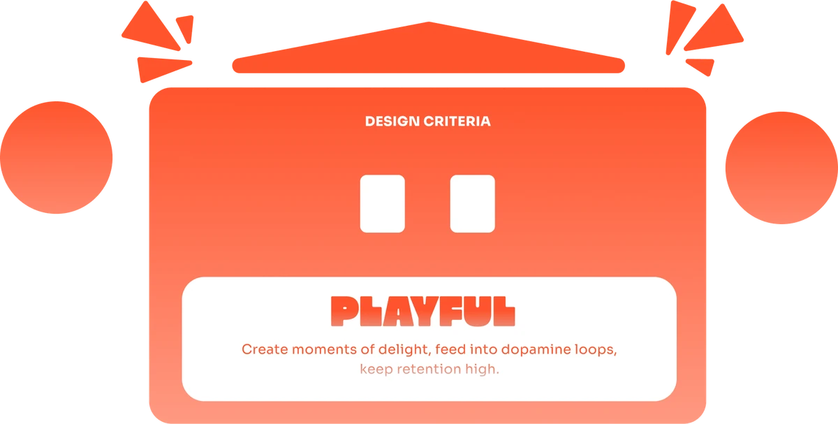
Design criteria: Accessibility. Making our product accessible and easy for everyone, even the laziest folks. Design criteria: Intuitiveness. Keeping features low friction and easy to understand so that users don’t have to change mental models. Design criteria: Consistency. Features will maintain cohesion across different interactions and follow brand guidelines. Design criteria: Playful. Create moments of delight, feed into dopamine loops, keep retention high.
1 / 4

Our Main Screens

Before any color or brand, we turned those three ideas into rough, grayscale frames and tested whether they held up. Three boards covered the core flows.

Swipe each row to see every screen.

Onboarding
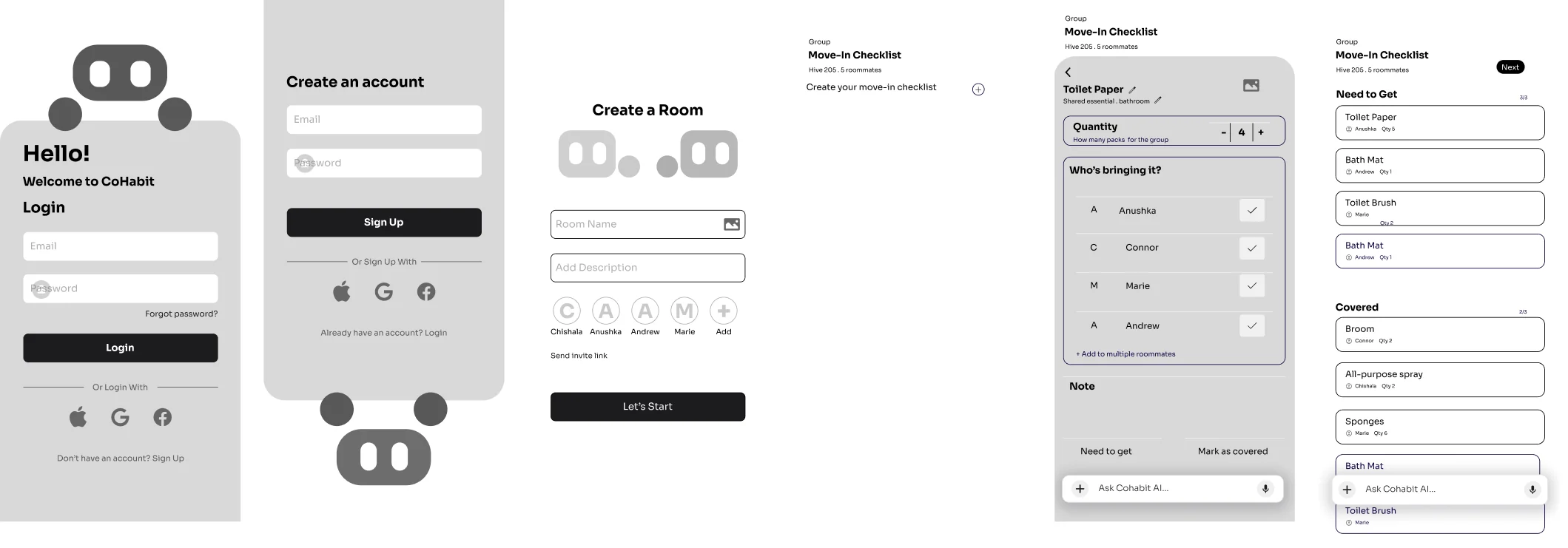
Six grayscale mid-fi screens: log in, create an account, create a room with roommates, and three steps of the move-in checklist where each item shows who is bringing it

Personalized AI and Chore Accountability
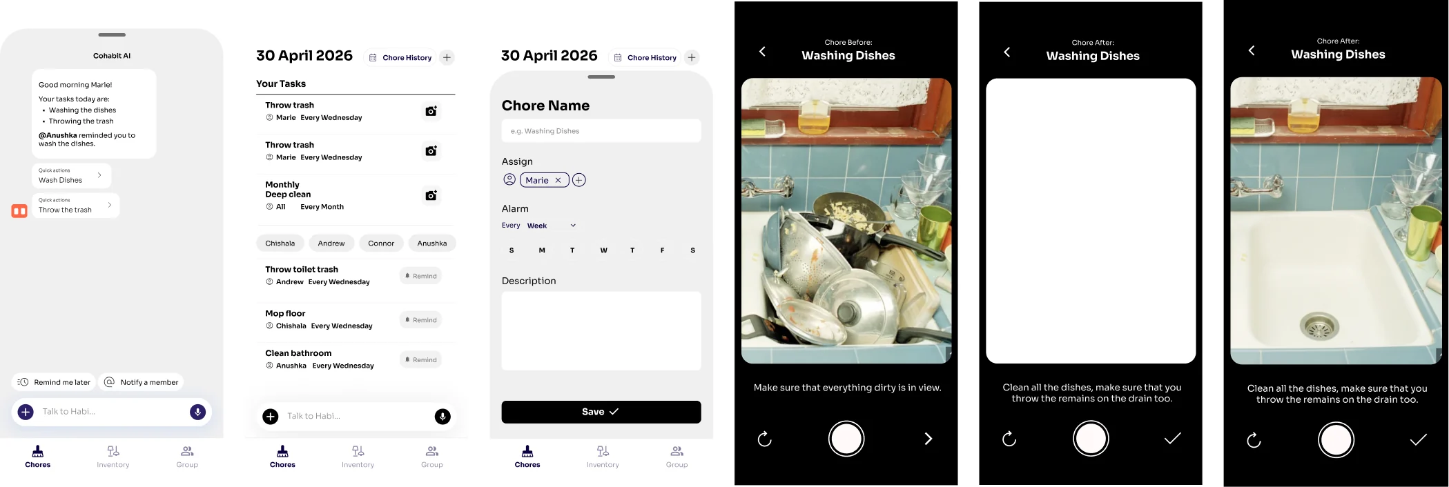
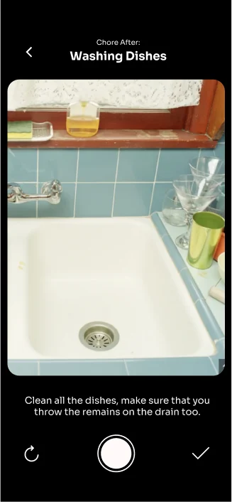
Six grayscale mid-fi screens: a Cohabit AI morning summary, today’s chores with a camera on each row, a new chore form, and before, during and after photo screens for washing the dishes

Room Setup and RA Escalation

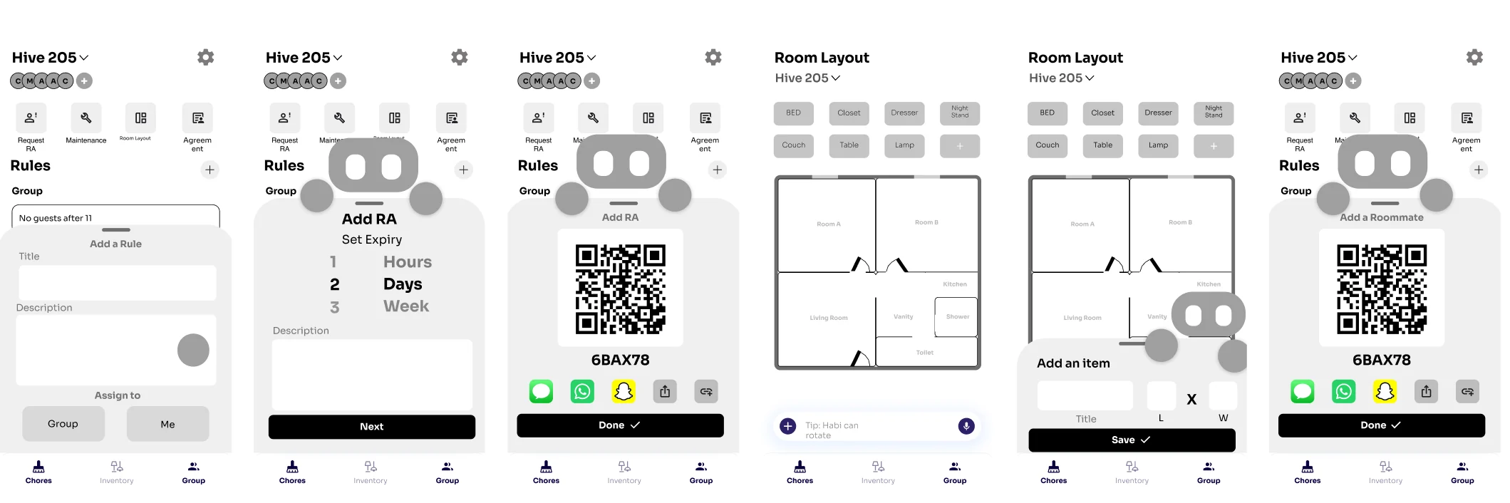
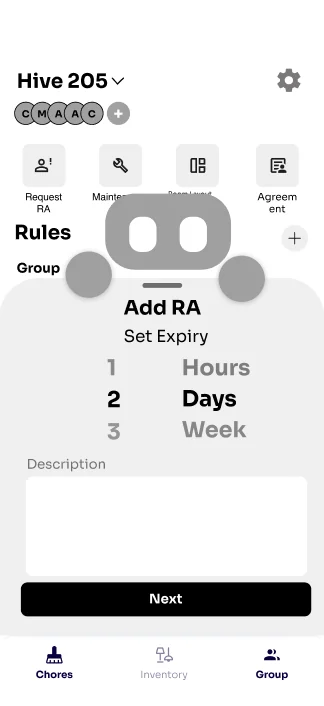
Six grayscale mid-fi screens: adding a group rule, adding an RA with an expiry, sharing the RA code, the room layout, adding a furniture item, and adding a roommate by code

Our Biggest Feature Additions

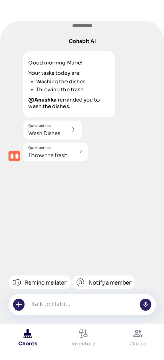
  • Mid-fi Cohabit AI screen with a morning summary of today’s tasks and a reminder from a roommate

    AI Companion

    An AI companion that allows for anonymous reminders and warnings to you and your roommates.

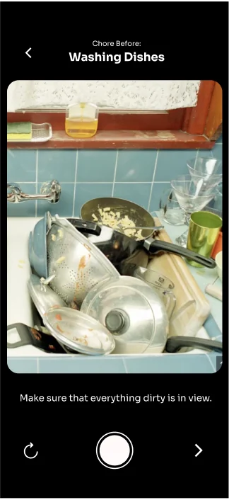
  • Chore before photo: a sink full of dirty dishesChore after photo: the same sink, empty and clean

    Updated Chore Flow

    Updated to better track before and after photos of additions to the room.

  • Mid-fi Add RA screen with a set expiry of hours, days or weeks

    RA Escalation

    Add your RA to the room for a set amount of time. They can view your room’s tracking history, but they get kicked out after a certain time, so your room doesn’t have a constant observer.

User Testing

SUS/NPS

In round one, five participants worked through the prototype and rated it with SUS and NPS. They liked how intuitive it felt and the RA feature. Visual design and navigation held it back.
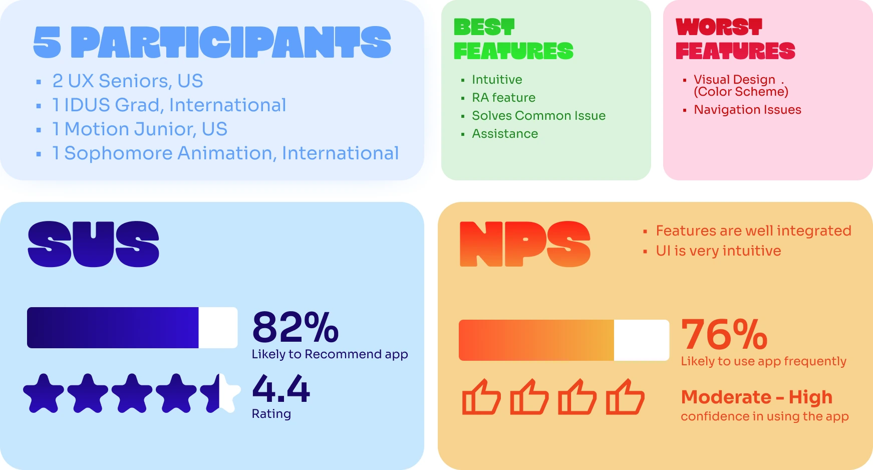
User test 1 results: 5 participants. Best features were intuitive, the RA feature, solves a common issue and assistance. Worst features were visual design and navigation issues. SUS 82% likely to recommend with a 4.4 rating, NPS 76% likely to use the app frequently, with moderate to high confidence.

Their suggestions were specific, so we reiterated.
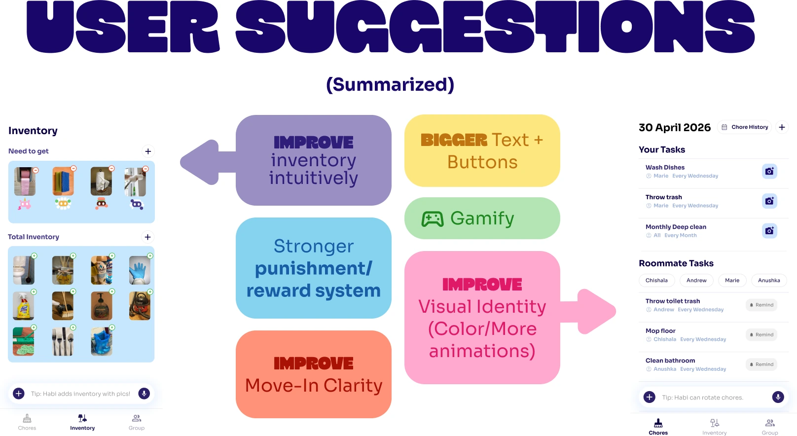
User suggestions, summarized: improve inventory intuitively, bigger text and buttons, gamify, stronger punishment and reward system, improve visual identity with more color and animations, and improve move-in clarity.
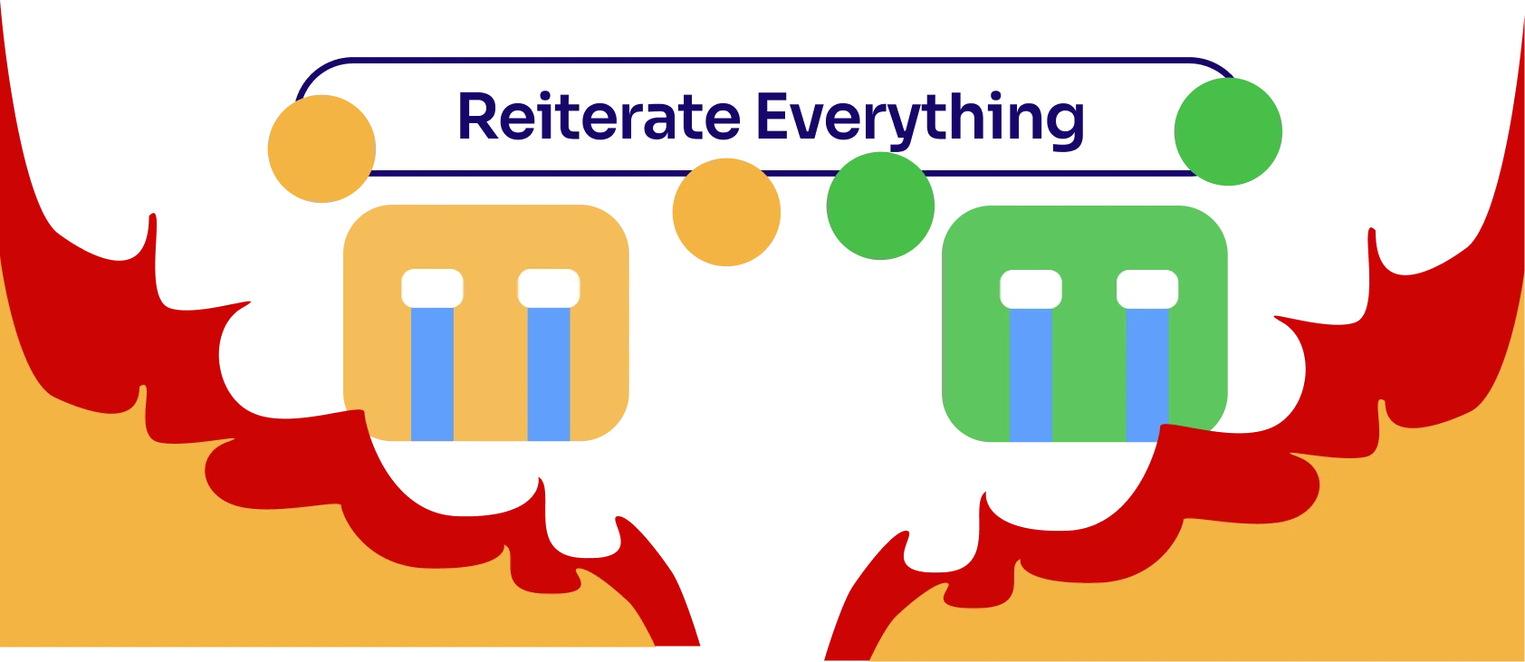
Reiterate everything: two crying Habi avatars with flames at the bottom of the frame

These are the updates that came out of that round.
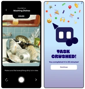
Patch Notes
Chore timer and completion screen: the camera view while washing dishes with a timer and a clearer retake button, then a

Included timer, clearer retake option, and completion screen when doing chores for easier accountability and branding
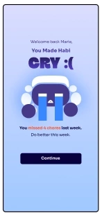
A Habi crying with the message

New dynamic punishment / reward week summary
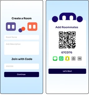
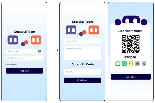
A Create a Room screen with Join with Code, and an Add Roommates screen with a QR code and share buttons

Improved the onboarding flow to allow faster roommate additions
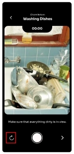
The chore camera screen with the retake button highlighted

Refined the retake process

The original Create a Room screen on the left, then the redesigned Create a Room with Join with Code, then Add Roommates with a QR code

Improved the onboarding flow

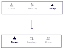
The bottom tab bar before and after, with larger icons and labels for Chores, Inventory and Group

Improved sizes and visibility of navigation

1 / 6

Round two brought in seven participants. SUS rose from 82% to 87% and NPS from 76% to 84%.
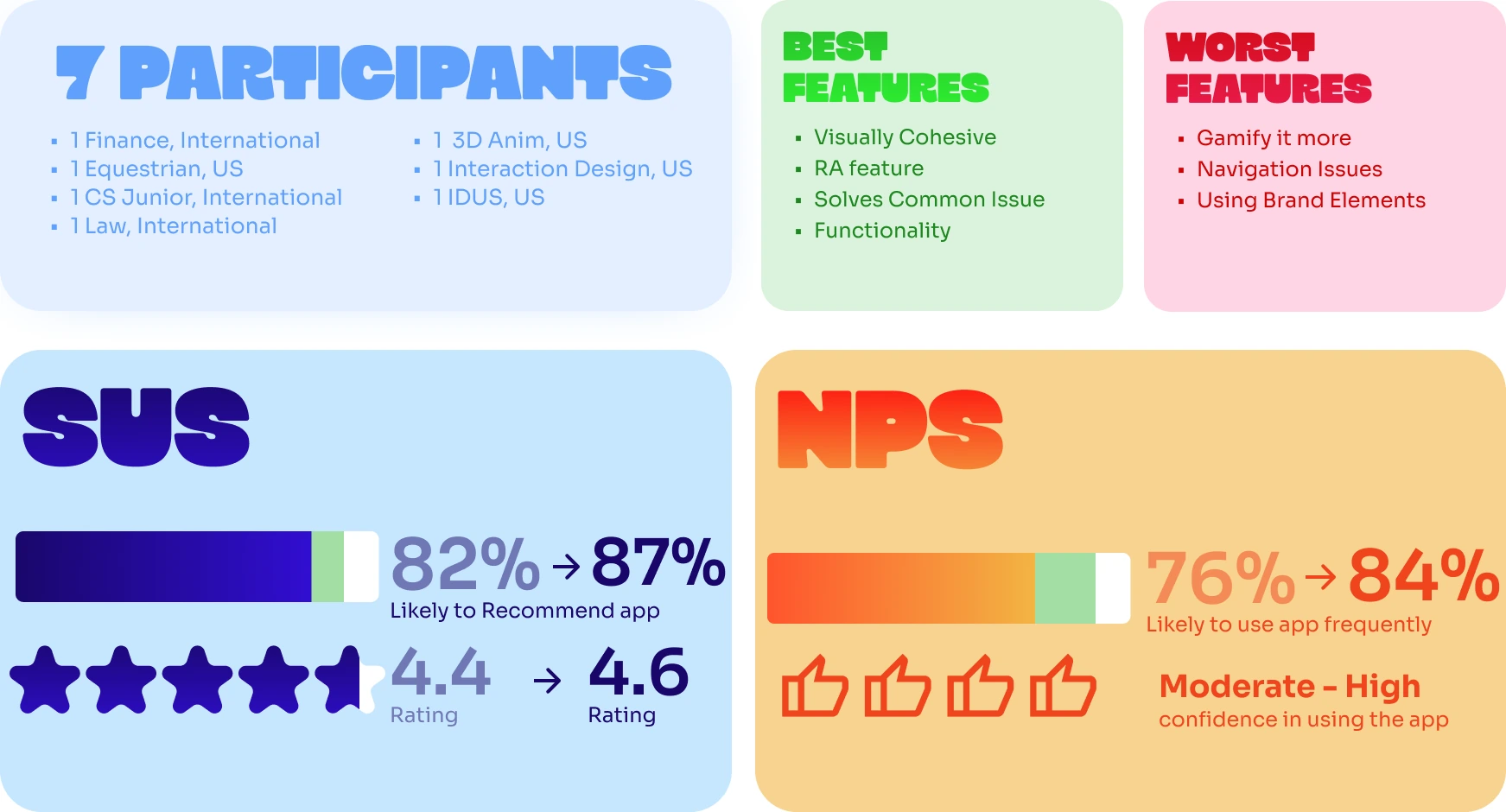
User test 2 results: 7 participants. Best features were visually cohesive, the RA feature, solves a common issue and functionality. Worst features were gamify it more, navigation issues and using brand elements. SUS improved from 82% to 87% and the rating from 4.4 to 4.6. NPS improved from 76% to 84%, with moderate to high confidence.

The Final Product

After testing, we created our final working prototype, with the future goal to partner with schools and universities.
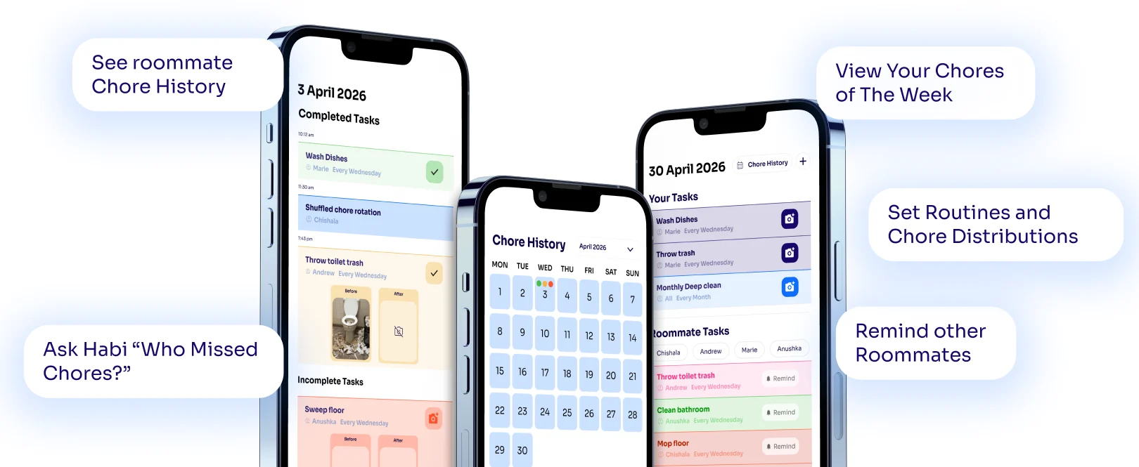
Three phones showing chore history, a monthly chore calendar and this week’s tasks, with callouts: see roommate chore history, ask Habi who missed chores, view your chores of the week, set routines and chore distributions, and remind other roommates
Pain point: roommates want chores done without constant nagging or direct confrontation. Interview quote: the only problem is sometimes some chores get left undone because one of us has chosen not to do it for a long while, and as a result we end up with either a really dirty bathroom or a dirty shower. Solution: chores laid out for each roommate, with nudges through automatic AI-powered smart notifications or an optional manual button. Complete a chore by taking before and after photos as real evidence
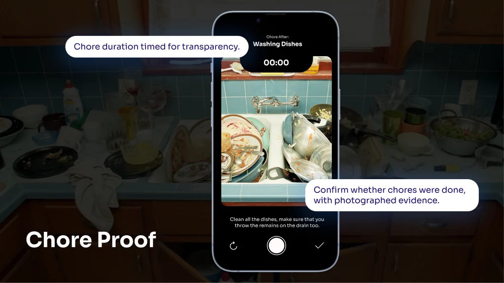
Chore Proof: the camera screen while washing dishes, with callouts for a chore timer for transparency and confirming chores were done with photographed evidence
Pain point: roommates can’t verify who did what and when, which usually comes out as verbal “have you done it yet?” or passive aggressive texts. Interview quote: people will often not realize that their behaviors are issues until it’s brought up directly to their face. Solution: a chore history with the before and after photos, so real proof is shown to every roommate and can be shared when escalated to an RA
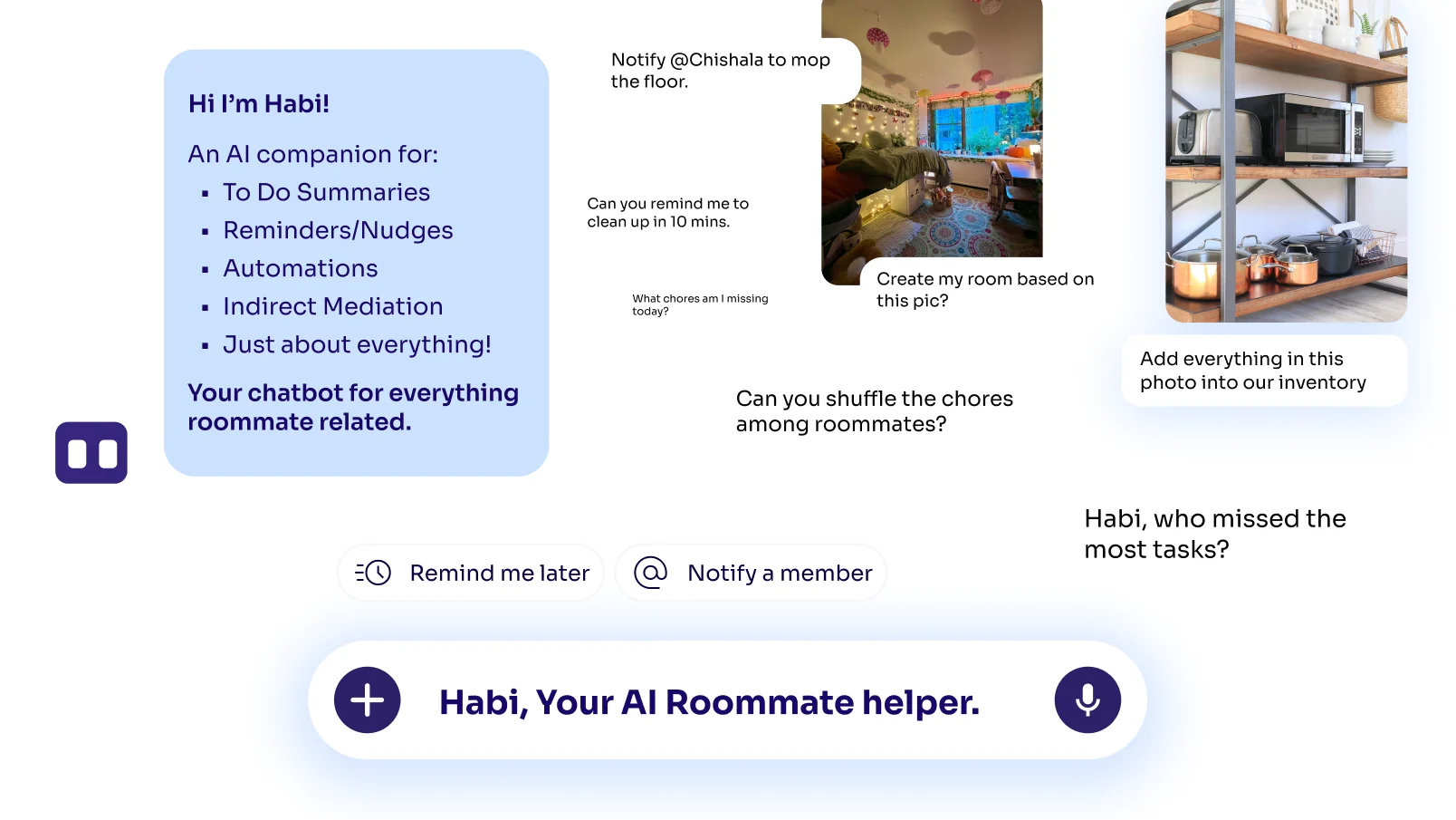
Hi, I’m Habi: an AI companion for to-do summaries, reminders and nudges, automations, indirect mediation and just about everything, shown with example requests like notify Chishala to mop the floor, create my room based on this picture, and add everything in this photo into our inventory
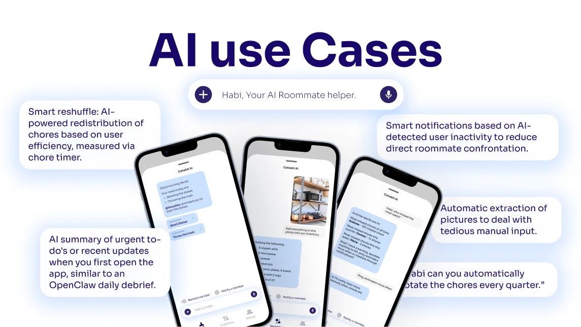
AI x UI: AI can automate what would otherwise take manual effort, UI is static but gives people clear mental models, a static UI that informs the AI means fewer hallucinations, and chat models that start with a blank screen are too open-ended
AI use cases: smart reshuffling of chores based on chore timers, AI summaries of urgent to-dos when you open the app, smart notifications that reduce direct confrontation, automatic extraction from pictures, and rotating chores automatically every quarter
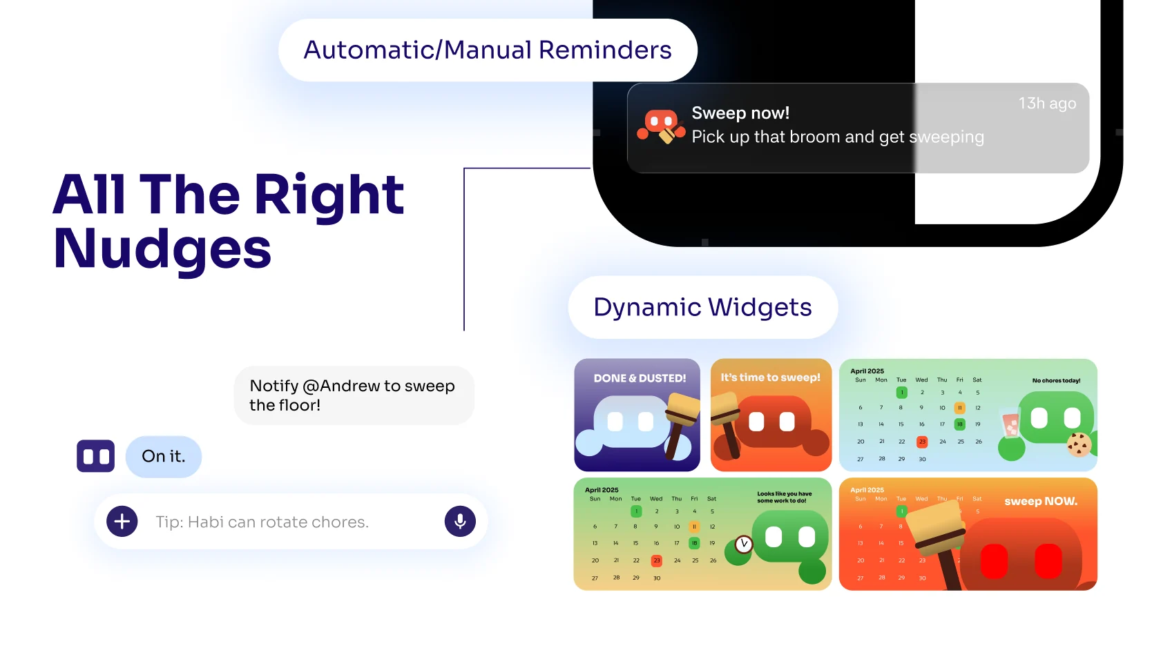
All the right nudges: automatic and manual reminders, a sweep-now notification from Habi, and dynamic home screen widgets
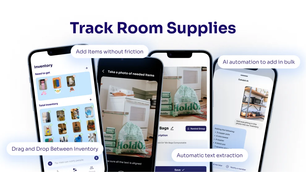
Track room supplies: an inventory with what the room still needs, adding items by photo, automatic text extraction, and AI that adds items in bulk
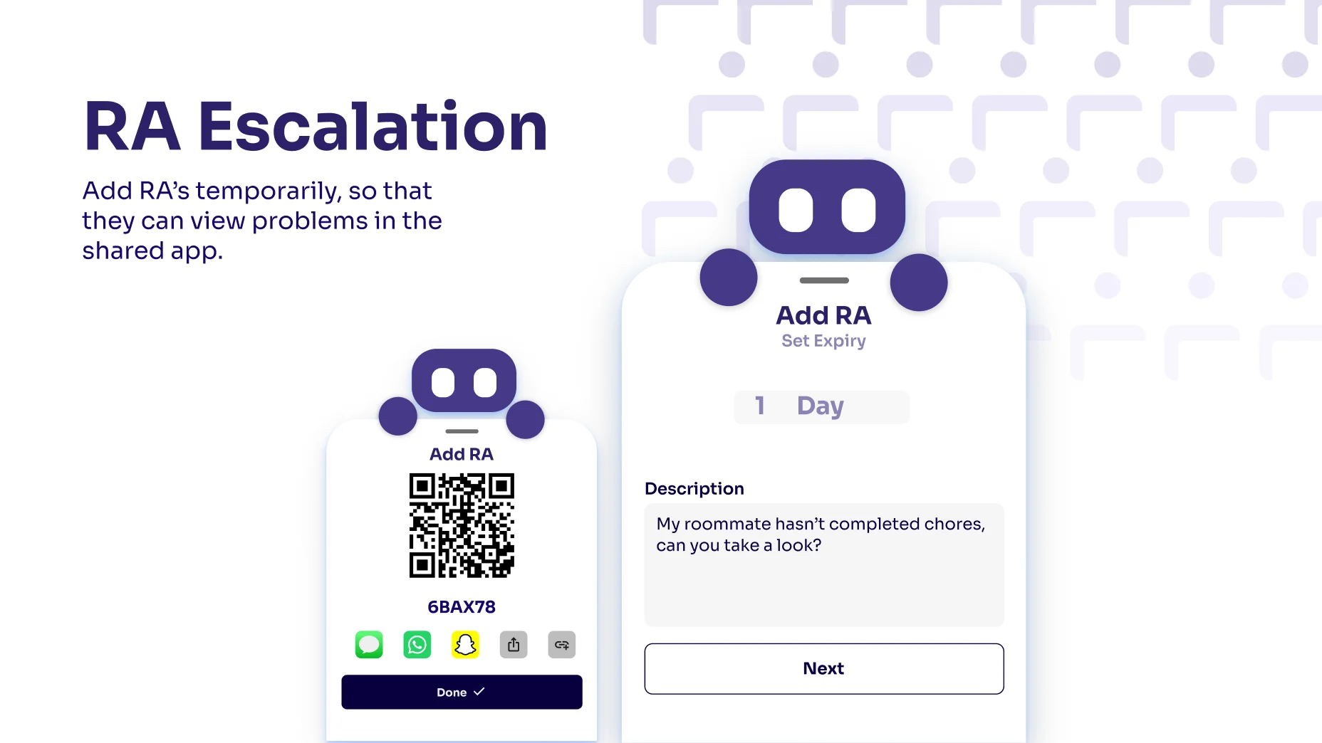
RA escalation: add an RA temporarily so they can see problems in the shared app, with an Add RA screen that sets an expiry and a QR code to share
Pain point: roommates hesitate to escalate issues for fear of causing more problems. Interview quote: I feel awkward going to the RA because it feels like I’m tattling, and I’m worried it will make things worse between us. Solution: make it easy, low friction and less formal for RAs to see the evidence of what happened, through a temporary link so they can view your room on your own terms
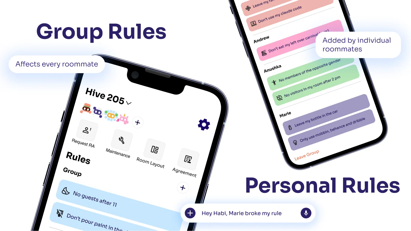
Group rules that affect every roommate, and personal rules added by individual roommates, on the Hive 205 group screen
Pain point: roommates want a clear and visible way to set boundaries. Interview quote: we, the RAs, allow them to go off and try the new rules and roommate agreement that we put in place. Solution: set expectations up front so roommates act early instead of arguing over boundaries nobody agreed on
Character customization: roommates pick their own Habi from dozens of silly designs to make the app feel more personal
Set up your room: a mini-game where roommates pick a preset layout based on their university’s dorms, then drag and drop furniture shapes into place
Thank you, with the Cohabit login screen and the screen where Habi cries over missed chores

A Peek at the Branding

The brand began as a background for our presentation slides and grew into the face of the product.

  1. A row of colorful houses with two windows each, the original presentation slide background
    01

    A neighborhood of houses, each with two windows, set the tone for our presentation slides.

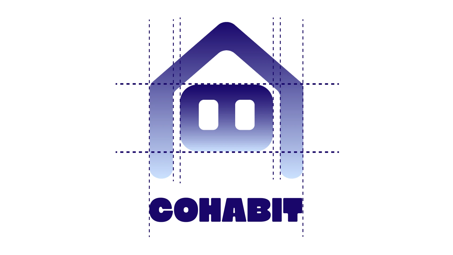
  2. Cohabit logo with construction guides
    02

    We distilled one house into a mark built from simple rounded shapes, with the windows as eyes.

  3. The Cohabit logo
    03

    The result is the Cohabit logo, a home with a face.
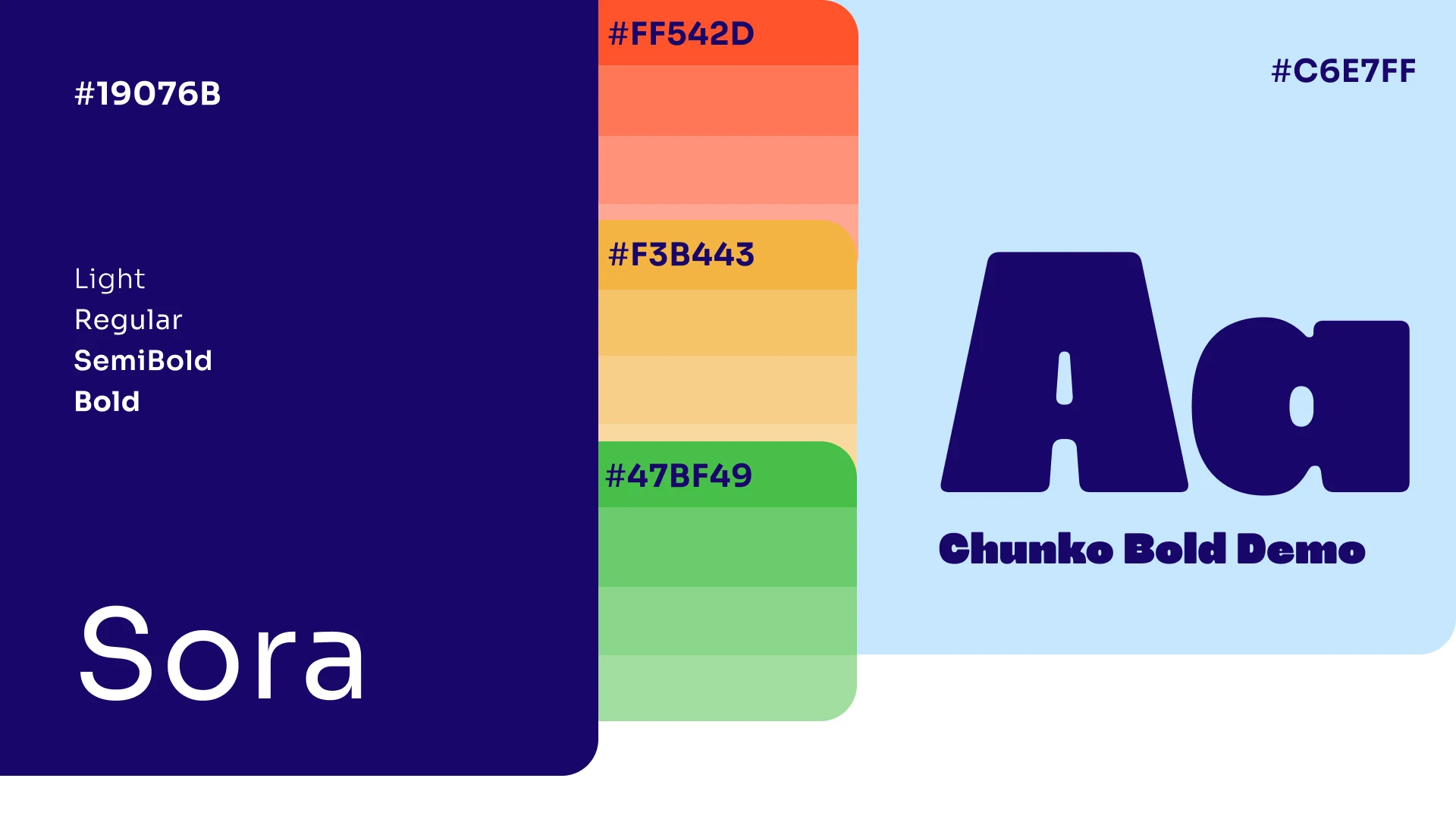
Brand colors #19076B, #C6E7FF, #FF542D, #F3B443, #47BF49, with Sora and Chunko Bold typography
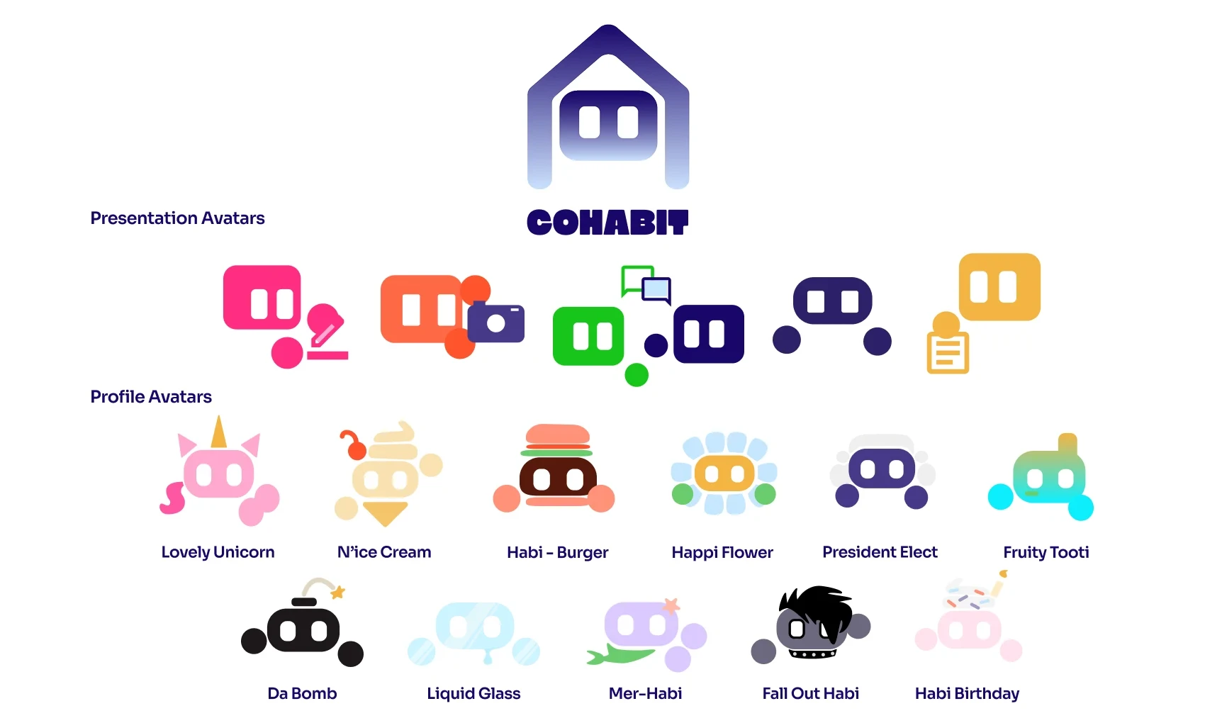
Cohabit logo with presentation avatars and profile avatars such as Lovely Unicorn, Habi Burger and Mer-Habi

A reminder can feel like a scolding. To keep Cohabit warm, we built the brand around Habi, an AI companion who reacts to how the household is doing.

Each roommate gets to choose their own Habi from a set of customizable avatars, so their companion feels like a part of the room.

Lovely Unicorn
N’ice Cream
Habi Burger
Happi Flower
Liquid Glass
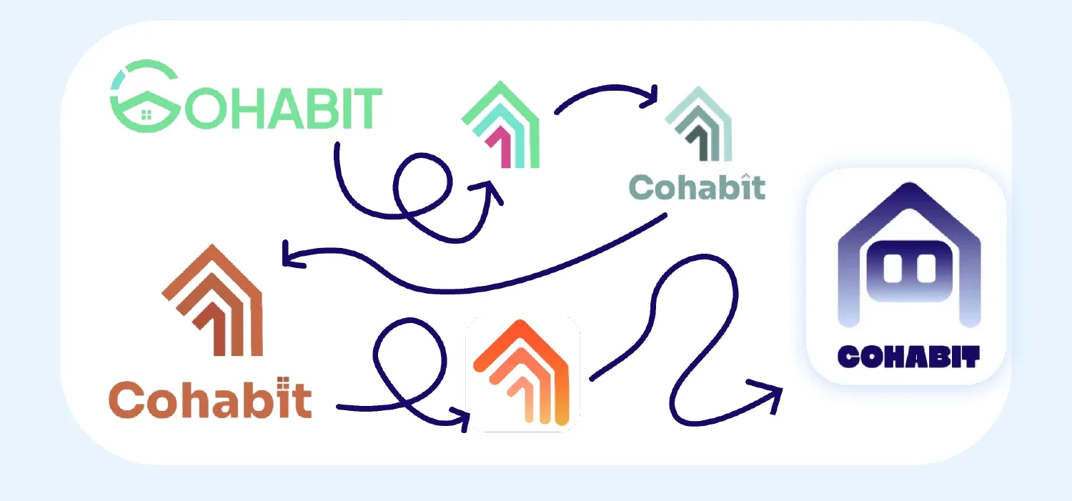
Early logo explorations, from a green and orange house wordmark to the final Cohabit logo

The Team

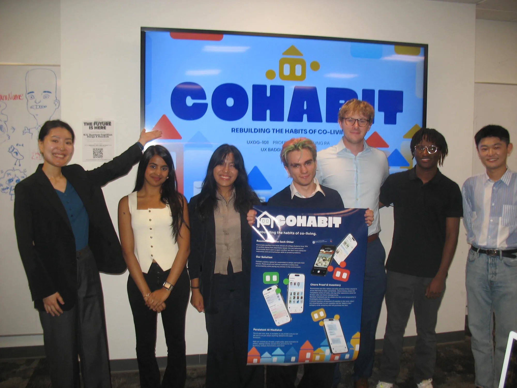
The Cohabit team after final presentations, standing in front of the Cohabit title slide with our professor Hayoung Ra on the left and an industry professional on the right
The Cohabit team after final presentations, with our professor Hayoung Ra on the left and an industry professional on the right